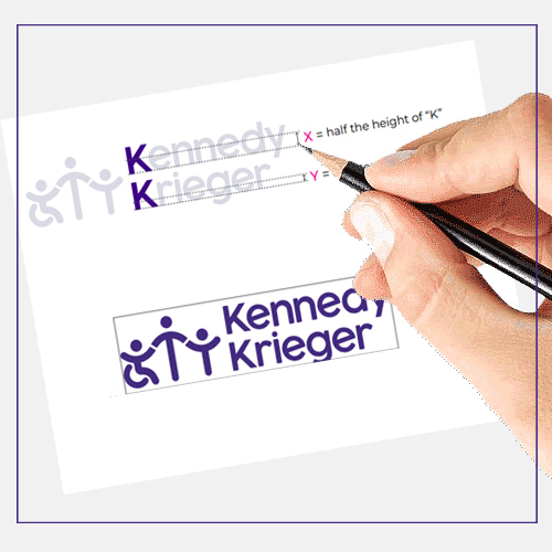
These guidelines provide important information and examples of the proper use of Kennedy Krieger’s brand elements for clear, concise, accessible, consistent communication that also protects our trademark and brand. The Kennedy Krieger marketing team follows these guidelines when producing work. The rules within should be used jointly with Kennedy Krieger Institute’s Style, Punctuation and Writing Guidelines, a resource for appropriate use of language for all of the Institute’s non-academic written content.
Introduction
Brand elements align your communcations to the mission and vision of Kennedy Krieger.
Learn about our:

Accessible Design
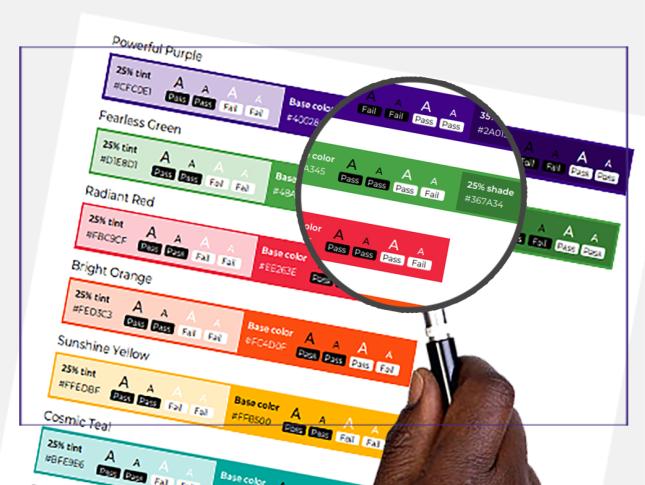
Our brand elements strive to ensure everyone can access our message.


